Six Principles of Logo Design
What's the deal with logos? Big brands redesign them and people hate them. Upstarts dump time and money into them, but worry they look bad. I believe this is a symptom of a misguided focus on interaction design at the expense of graphic design. Logos are the simplest graphics of all, so understanding them can unlock universal design principles to judge good from bad on any screen software can appear.
Contents
- Is this logo bad? How passing judgment on JC Penney and trying to do it myself forced me to write this essay.
- Principles of Logo Design: Logos should have contrast, be scalable, simple, distinct, symbolic, and systemic.
- Underlying Formal Principles. Our principles have deeper roots.
- Separating Form from Content. We get it wrong judging the brand, not form.
- What is the hate really about? Our contemporary community bonds by hating the work of outsiders, but misunderstands the job of logos and turns its back on roots in graphic design.
- Some examples. Applying our principles to familiar and new logos in the wild.
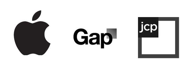
Every time a big brand comes out with a new logo a wave of scorn ripples through the Internet. It is fun to criticize big brands like Gap or Microsoft when their effort seems lame and their execution poor. It gives us evidence of how they “don’t get it.” We feel free to pan them as bloated companies ripe for disruption by some nimble upstart competitor with a better sense of taste. At least this seems to be a common narrative people tell to explain their dislike for a new design.
Early this year JC Penney unveiled their “fair and square” logo as part of a sweeping update to their brand. I heard about this when a designer on my team blurted in disgust, "Gross!” He shared a link and I cried, “What were they thinking?!” Later that day the team read articles panning this new design. Our team got into it by critiquing their color selection for its "unpleasant visual friction" and its shape—two interlocking squares—which we described as a "disaster." Not everyone agreed, but our dissenters were quickly labeled as "not getting it" either and conversation stopped. This did not feel right though. Then later that day something Jason Fried, a person who's eye for these things I respect, got my attention by tweeting:
When logo design critics hate a logo, I typically like the logo. Go figure.
Go figure. Our dissenters were quieted, but not alone. What makes someone a "logo design critic" and someone else open to liking a logo like JC Penney's? Is there really no accounting for taste? When I had the chance to redesign a logo several weeks later, I challenged my team to dig into this topic. What really makes a logo good or bad? Did JC Penney’s logo really suck? If so, could we explain why in ways we could apply generally to all logos or all visual designs?
When we dusted off our old college graphic design books and explored fresh research material online to try to answer these questions, we were disappointed. There seemed to be a big gap between the contemporary understanding of our "logo critic" peers and the advice of institutions and masters we had studied early in our careers. It felt as if our peculiar niche of web software design had ignored graphic design history and gone about their work as if their field was entirely new. But it isn't.
Inspired to get back to our roots, we set about re-establishing criteria to judge our good work from our bad. An important point is that our goal was not to be overly analytical—we wouldn't strip the heart out of our design process—but to ground our intuition for beauty in consistent reasons why. We imagined principles that would help us designers on the team to challenge and develop our designs. Since most of the people "using" a logo are not professional designers, we wanted to teach these principles to others so that they could better frame their input as well. We found six ideas we were able to reliable use. I nominate them here as six fundamental graphic design principles of logos.
Principles of Logo Design
Good logos do many things well. They stand out from their surroundings, remain recognizable when very tiny or quite large, are simple enough to be recognized and remembered, are not confused with other logos, embody the meaning of a brand, and work well in a diverse set of graphics.
Whew! Where did I get this stuff? Initially my team and I turned to two contemporaries who published some excellent advice about how they think about designing a logo. Jacob Cass' five principles of effective logo design (simple, memorable, timeless, versatile, appropriate) and David Airey's more understated logo design tips pointed us in a good direction. As we applied their advice, we hit roadblocks applying broad concepts like "timelessness" to our decision-making. We felt that some of the advice depended too much on references to successful big brands for context and not enough on pure form that could be generalized to any context. We pushed ourselves to build on their work arguing that principles should be like theories and dispense advice in black-and-white: yes it does or no it doesn't.
One key piece of inspiration came from an unexpected source: a 57-year-old industrial design book by Henry Dreyfuss titled Designing for People. On page 59 Dreyfuss describes a concept his firm called "survival form":
Almost without exception, our designs include an ingredient we call survival form. We deliberately incorporate into the product some remembered detail that will recall to the users a similar article put to a similar use. People will more readily accept something new, we feel, if they recognize in it something out of the past.
This insight led us to add two wrinkles to our principles:
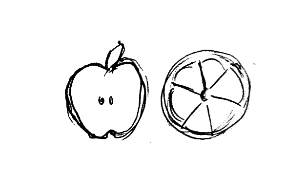
- Direct symbolism—Many of the logos most cited as "iconic" tended to assume an obvious, familiar, literal form of the name they represented (e.g. an apple, a shell, a target).
- Survival traits—Since logos had to represent something in the most hostile and unpredictable of environments, we could view our principles in Darwinian terms: can it do its job or not?
Granted, neither of these are quite what Dreyfuss intended, but our liberally interpretations proved to be extremely useful. The second insight in particular—survival traits—was inspiring and helpful. Instead of recommending a logo be "versatile" as Cass an others had, we began to understand how minute changes in form could allow our logo to be recognizable on a t-shirt or sticker from across the street or not because of how well we considered its ability to scale or contrast in the wild.
These are just a start, but I and my team feel, a damn good start. Below are examples of what we mean and how we use each of the six principles.
Contrast
A limited palette of vivid, mostly solid color is the best rule of thumb to achieve appropriate contrast. Do not be seduced by the rich color and high screen resolution on your designer's gigantic monitor—your logo needs to survive when photocopied on a thing sheet of paper or printed on a favorite worn out old company t-shirt five years from now. Wild color variation, gradients, and transparencies don't hold up well in those conditions.
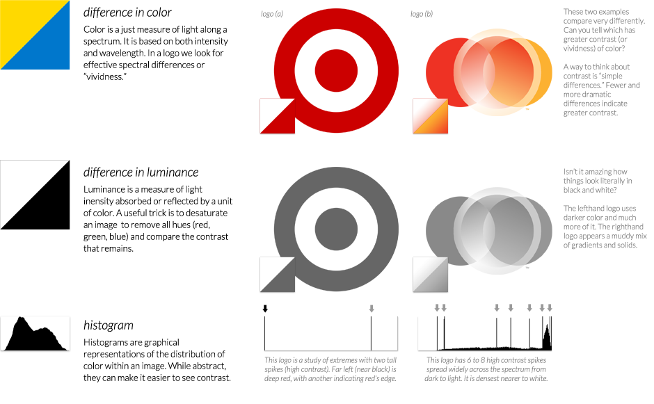
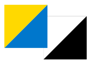
Again, think of these attributes as "survival forms." A logo has to be capable of separating itself from any background it might appear on, as well as being a clear and intense signal amid the noise of other imagery surrounding it. Another good rule of thumb about contrast is to exaggerate the luminance (all black) and invert it (all white) to see how well the form coheres. Logo (a) uses a single strong and warm color to "stand out" anywhere it appears. In contrast, logo (b) applies 11 gradients across four overlapping or nested circles, detail that causes the logo to visually recede into any context.
What appears to happen when a logo evolves (or devolves) like this is companies and their designers fall in love with the ornamentation their tools are capable of creating. What gets lost is the effective, often beautiful simplicity that one- and two-color print era designs achieved by chance of their more limited tools.
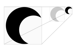
Scalable
Trying to fill the volume of a circle or square is the best way to create a logo that remains recognizable in a range of sizes from very small to very large. This approach also produces logos that tend to fit in variable contexts out in the wild, where unforeseen noise or adjacent shapes might squeeze or obscure a tall or wide logo.
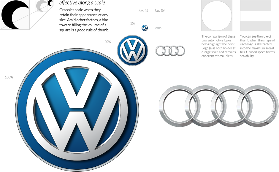
How is scalability a survival form of a logo? For one, the logo will be literally printed or displayed at very small sizes (e.g. a favicon in a web browser) or very large sizes (e.g. a billboard). Additional, people's proximity to a logo impacts its apparent scale. For instance, while your logo may be printed quite large on a t-shirt, it will only be recognizable from 10 feet away as a poorly scaled graphic, but 100 feet or more away as one that scales well.
A byproduct of this principle is that text-only logotypes generally prove less effective than a graphical logomark because text tends to remain short but stretch wide to fit a word form. We tend to think of "iconic" logos as memorable marks of famous brands and this is due in part, I think, to the ability of a scalable logomark to represent the brand on its own without the name typed out alongside it (e.g. Nike, Apple, McDonald's).
Simple
A logo is simple if composed of the fewest possible elements to express a complex shape or suggest multiple layers of meaning relevant to the brand. Put another way, we can say a logo has formal simplicity when the whole is greater than the sum of its parts, or symbolic simplicity when potent ideas are woven in.
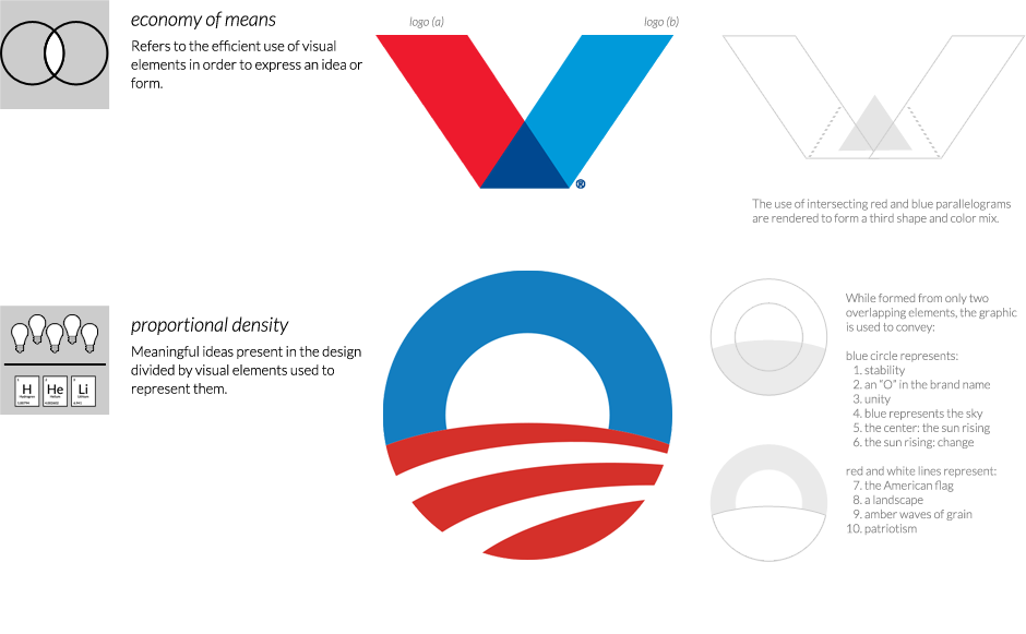
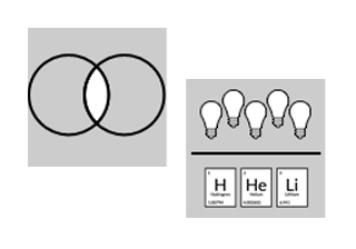
Another phrase for what I mean by formal simplicity is economy of means. One example of this appears in logo (a) above using shapes of two colors combined to suggest a third shape and color. The idea is to express a memorable form with the least amount of form.
The symbolic aspect of simplicity is expressed in something Noam Chomsky called proportional density. You want your logo to be rich in meaning, but sparse in elements. An exemplar is found in logo (b) where up to 10 meaningful symbols are expressed by only two simple shapes.
While the two aspects I have just mentioned attempt to pin down "simple" into concrete, black-or-white descriptions, the fact is that simple can mean many more things. In fact all of our logo principles err toward their own kind of simplicity—graphics that resolve themselves well in various circumstances—but in practice my team interpreted "simple" to mean something closer to economy of means and proportional density.
Note: The "good" writing in this essay currently stops here. Read on with caution. It's gets pretty rough.
Distinct
Logos have to appear different from their peers so they aren't easily mistaken for them. The point is to spread recognition for a brand, but nothing will dilute that effort more than inadvertently reminding people of some other one. Fortunately 90% of all logos apply our other principles poorly or not at all, so ours will have a leg up.
The best advice we found was to look at our work in the context of many others. In particular we made sure we knew other logomarks in places where our brand would typically appear. Knowing the others will help you easily navigate your own decisions at any stage of a new design.
When redesigning the logo of an existing brand, designers face another decision. Do they invoke elements of the current logo so the new is recognizable with the old, or do they separate it entirely? Our rule of thumb is based on Dreyfuss' hunch about survival forms—err on the side of familiarity, proceeding cautiously into wholly new territory.
Symbolic
A logo should embody a name or meaningful idea about a brand. Too often logos punt on symbolism because it is too hard. Often this is because the brand's name is already muddled and not memorable, or meaningful ideas about what its function is are unclear or unstated. When present, symbolism in a logo is an incredibly potent way for people to recognize and remember it.
I mentioned earlier the concept of direct symbolism. This is something my team stumbled onto we asking which logos were widely recognized as "timeless" or "iconic." The answer, more often than not, was that the best logos tended to be fairly literal representations of one simple concept. Think of an apple, a target, or a shell, and certain logos and brands immediately spring to mind. To do this requires the enormously difficult selection of a simple name as well as the enormously difficult task of not screwing it up with a complicated image. Accomplishing both is so hard that achievement in direct symbolism is rare, rare but valuable.
This idea can extend further into direct symbols of concepts important to a brand, for instance Evernote's elephant which embodies their tagline and purpose to "remember everything." This only works when the association between image and meaning is widely understood.
Systemic
All logos should be designed as part of a whole visual system of sibling graphics operating in a variety of contexts, not designed in isolation or only in one context like a website header or a business card.
Need to research the typical aspects of this including screens versus print, variations associated with different topics, and tangent graphics that make sense when paired with it. We only scratched the surface!
Underlying Formal Principles
Our logo design principles helped us concept and critique our work. Actually creating a good logo, however, relies on formal principles just like any graphic should. To the degree we have been able to make the intangible tangible, here is how we learned to think about our work.
I believe the desired results constitute most of what people think of when they say “design.” They are the qualities that trigger strong positive emotions in a well-designed product, graphic, clothing, building, automobile, or more. When a company etches “Designed in California” on their products, part of what they’re communicating is that it is something well-crafted, engineered intentionally to be pleasing for you and I.
Think of structure and rendering as two layers that interplay together. When creating a design we often find ourselves starting with the structural elements first. This happen in sketches that push and explore a variety of shapes, weights, and scales that let us consider the whole of several designs relatively quickly. Once we zero in on concepts we like, we render them in greater fidelity using color, contrast, and precise structure. This happens in ink or in digital form on the computer.
Again, there is a tight interplay between these two modes. Sometimes concepts suck once you render them, which forces you to create new ones. Other times rendered graphics spark new ideas the structural step did not. It’s a give and take.
Separating Form from Content
Much of the feeling a logo imparts has nothing to do with its form. People respond because of what they signify--often a corporation with a mass market product, how your social groups feel about it, or what you remember from your own history of experiences with it.
When the identity of the company is familiar, It is not possible to separate the content of their reputation from the form of the logo mark. We cannot simply forget what a company like Apple or Target means to us in order to critiques their logo with fresh eyes. This is part of what makes widespread negative remarks of logo critics so often dubious--are they critiquing the logo or criticizing the brand?
But we can critique logos unburdened by any symbolism when we experience a new logo with an unfamiliar brand for the first time. We see this at play as designers share new ones with their peers. Their discussion focuses on the formal structure and rendering of these designs. Curiously many of the trends we noticed here tend to be complex and ornamented renderings that violated our principles. Tesselation or rich texture like DC Comic’s new logo are eye-popping in high resolution display or print, but tend not to be simple, scalable, or systemic enough to work in the wild. Could it be us designers falling in love with our powerful new tools?
To combat this we appreciated the effort of some contemporary logo masters to establish better criteria to keep our judgment intact. Like we mentioned, much of this criteria was brittle under everyday use.
For instance, while it is true that McDonald’s golden arches can be called “memorable,” does that quality owe more to the logo mark’s form or its wide history of use? We found it far better to think of a logo’s potential to be recognized again as a function of all six of our principles working together. The fact that a design mark is simple, vivid, and distinct would make it easier to remember.
Or consider a lot of the advice arguing for making your logo “timeless” while citing popular brands like Omega watches or PBS. This concept is tricky. The fact that a brand’s most recognizable mark has stood the test of time does not necessarily mean its formal qualities are great. The positive emotion people feel when seeing them can easily come from other aspects of the brand’s reputation that get tacked onto that form.
The idea of timelessness did not make our cut as a logo design principle, however it shape our principles around the idea of being modern. We defined ‘modern’ not as ‘contemporary’ bu in the manner Paul Rand did--striving toward universal with an absence of trend or sentimentality. This often means restricting ornamentation in the favor of simpler elements to avoid anchoring a design in a period-specific fad. In this way our entire set of principles feels modern.
What Is The Logo Hate Really About?
Need to rethink my reasoning here based on feedback from a friend.